2020—2021
New mobile experience
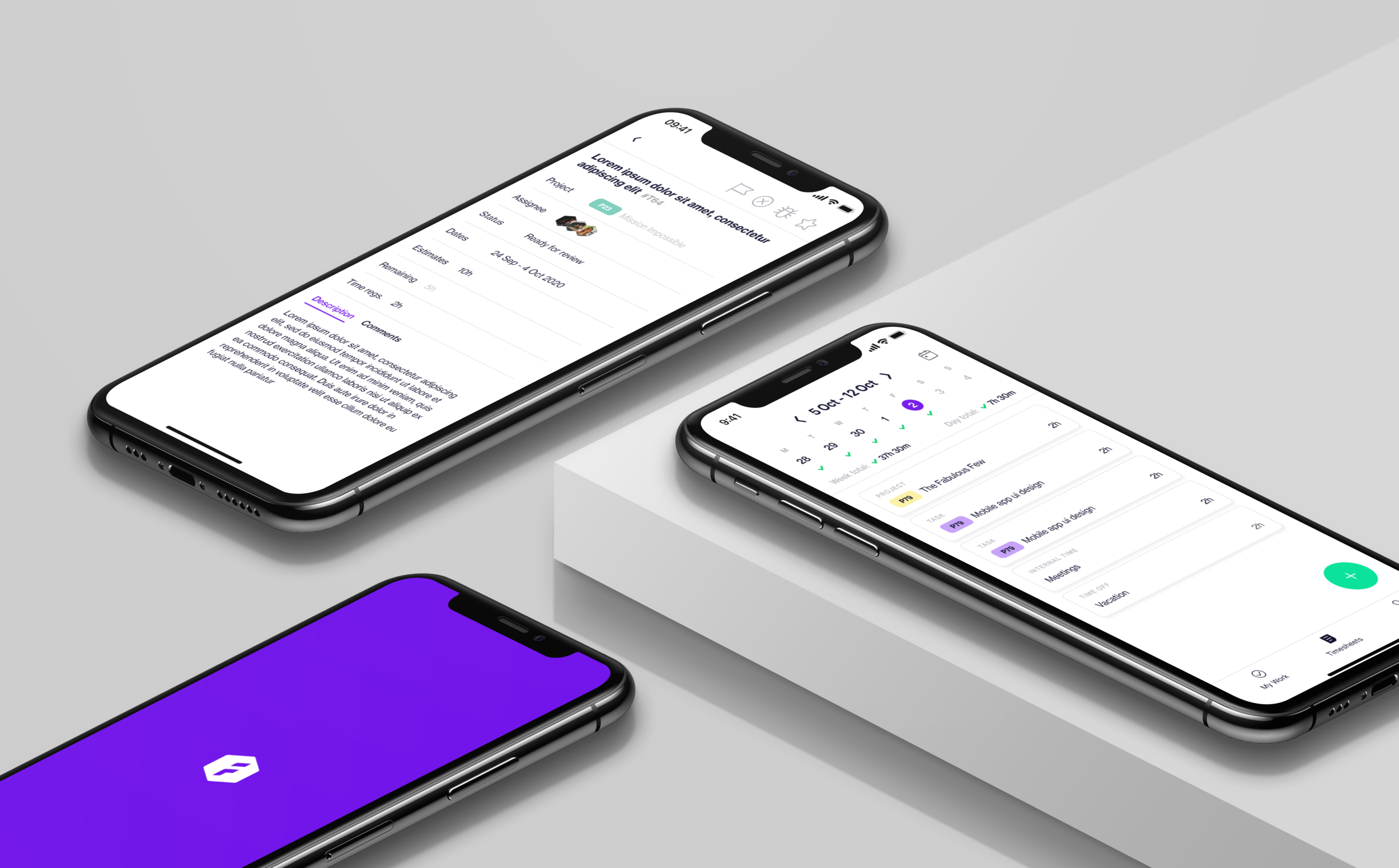
The Forecast mobile app had not been updated for a while and was not aligned with the web app. We were asked to do a complete overhaul of the mobile app which of course included a redesign of the entire user experience and the user interface. The goal was to ensure consistency, and to create a simple and intuitive mobile experience.
Roles and responsibilities: Concept Development, Wireframing, Prototyping, Information Architecture, User Flows, Interaction Design, UI Design
Requirements
It was very important that streamlining the mobile app with the web app, wouldn’t compromise the overall mobile experience. There were different pain points, but the main area of focus was time registration.
The requirements included making the mobile experience feel simple, which allowed us to concentrate on a subset of features you could use. These features were:
Ability to get an overview of the tasks you need to work on (what’s overdue, in progress and done)
Ability to create a new task and to update its properties
Ability to manage and track your time registrations
Look and feel
To ensure the same look and feel between the two platforms, the design was in desperate need of a makeover as all the components were outdated. This meant an update to the icons, colours, shapes, illustrations and how you interact with the app.
While it was important to streamline across platforms, it was equally important to focus on known and familiar mobile patterns e.g. interactions, gestures and native pop ups.
In order to understand if we created a good user flow, we continuously tested the implementation and improved upon it based on user feedback.
Cheers to everyone I had the pleasure to collaborate with on this project.
Check it out live and give the Forecast app a try.


